ⓘ The following histogram demonstrates the peptide length distribution of the sample(s) uploaded. Peptides labelled with #CONTAM or #DECOY in the accession column have been filtered out. Peptides with a length of 5 to 30 residues have been selected. The error bar in case of replicates represents the standard deviation of the number of specific n-mers across replicates. The switch button below the graph can be used to display relative frequency or absolute numbers. Click the tool icons at the top right corner for more operations.
#CONTAM
#DECOY
ⓘ The UpSet plot depicts peptides after pre-processing: peptides labelled with #CONTAM or #DECOY have been removed, as well as post-translational modifications (PTMs) and any resulting duplicates. For MHC class I analysis, 8–14-mers; for class II, 12–20-mers are used for the analysis. 📥 Click any bar to view the peptide overlap motif (only for MHC I) and download the corresponding peptide list.
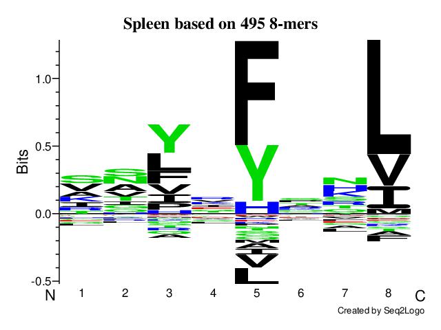
ⓘ The Seq2Logo depicts peptides after pre-processing. Peptides labelled with #CONTAM or #DECOY are removed. PTMs and resulting duplicates are also removed. For MHC class I analysis, either 8-mers or 9-mers are used based on the user's choice. Class II analysis uses 9-mer cores predicted by netMHCIIpan-4.3.
ⓘ Gibbs Clustering has been applied to peptides after removal of peptides labelled as #CONTAM or #DECOY, PTMs and resulting duplicates. For MHC class I analysis is based on 8-14-mers, for MHC class II the analysis based on 12-20-mers (duplicates removed). Each logo is labelled with the predicted source allotype and PCC (Pearson Correlation Coefficient) value, as determined by MHC-TP.
Best match : H2Kb (ref) PCC score : 0.49
Best match : H2Db (ref) PCC score : 0.77
Best match : H2Kb (ref) PCC score : 0.56
Best match : H2Db (ref) PCC score : 0.72
ⓘ We propose a novel algorithm, MHC-TP, to predict MHC I alleles based on peptide clustering results, allowing in silico MHC typing of datasets, where genetic MHC typing is unavailable, ethically restricted, or cost-prohibitive for large-scale datasets.
ⓘ The following downloadable CSV files contain majority-voted binding predictions. Each file includes all peptides from your uploaded data, along with predictions from all selected tools. In addition, the files contain tool-specific prediction columns such as ranks, binding levels, affinity scores, cores, and other outputs provided by each prediction tool. This ensures that, while you can easily see which peptides are majority-voted binders, you also retain full access to the individual predictions from each tool for every peptide. Binding prediction has been applied to a peptide list after removal of peptides labelled as #CONTAM or #DECOY, PTMs (for example, “A[+28.03]TFGVDESNAK” or “A(+28.03)TFGVDESNAK” are treated as “ATFGVDESNAK”), and resulting duplicates. For Class I, 8–14-mers were used as input, whereas for Class II 12–20-mers were used.
Key columns in these files include:
ⓘ The below UpSet plot provides a visualisation of the overlap of predicted binders across the uploaded samples. Each sample represents one of the user-uploaded datasets, and the values correspond to peptides predicted as binders. Users can explore results from any of the available binding prediction tools via the dropdown menu, or view the default option of majority-voted binders (across all tools). On the left, a list of alleles of interest is provided—selecting an allele regenerates the plot for that allele. Please note that this plot does not display binding results directly, but instead highlights how predicted binders are distributed and overlap across different samples. Seq2Logos are generated based on 9-mer cores (duplicates removed) predicted by binding prediction tools.
ⓘ The violin plot visualises the distribution of predicted binding values for peptides that are a subset of the binders shown in the UpSet plot. Only peptides within tool-specific thresholds for strong or weak binders are included. Thresholds vary depending on the prediction tool and MHC class, for example:
This violin plot complements the UpSet plot by allowing for a comparison of binding value distributions between unique and shared peptide binders within tool-specific thresholds.